

A Place To Grow



Branding
Digital
Brochure
Motion Graphics
Signage & Wayfinding
Merchandise
CGI's
Social
Photography
Videography
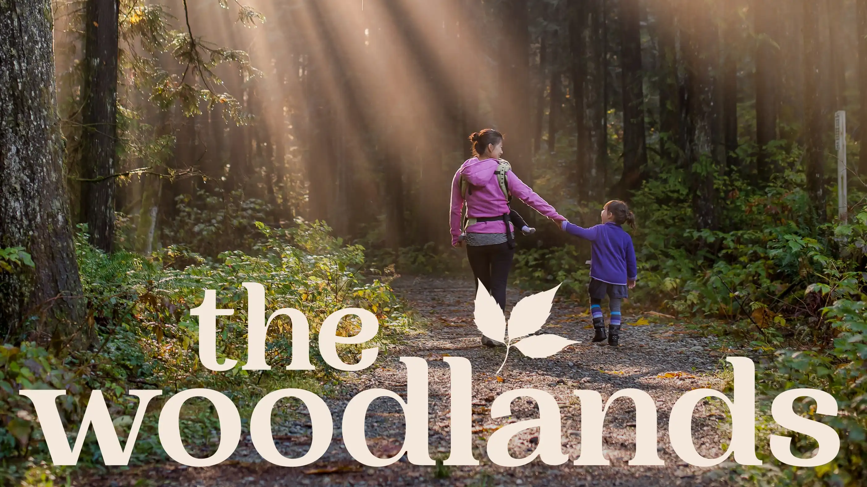
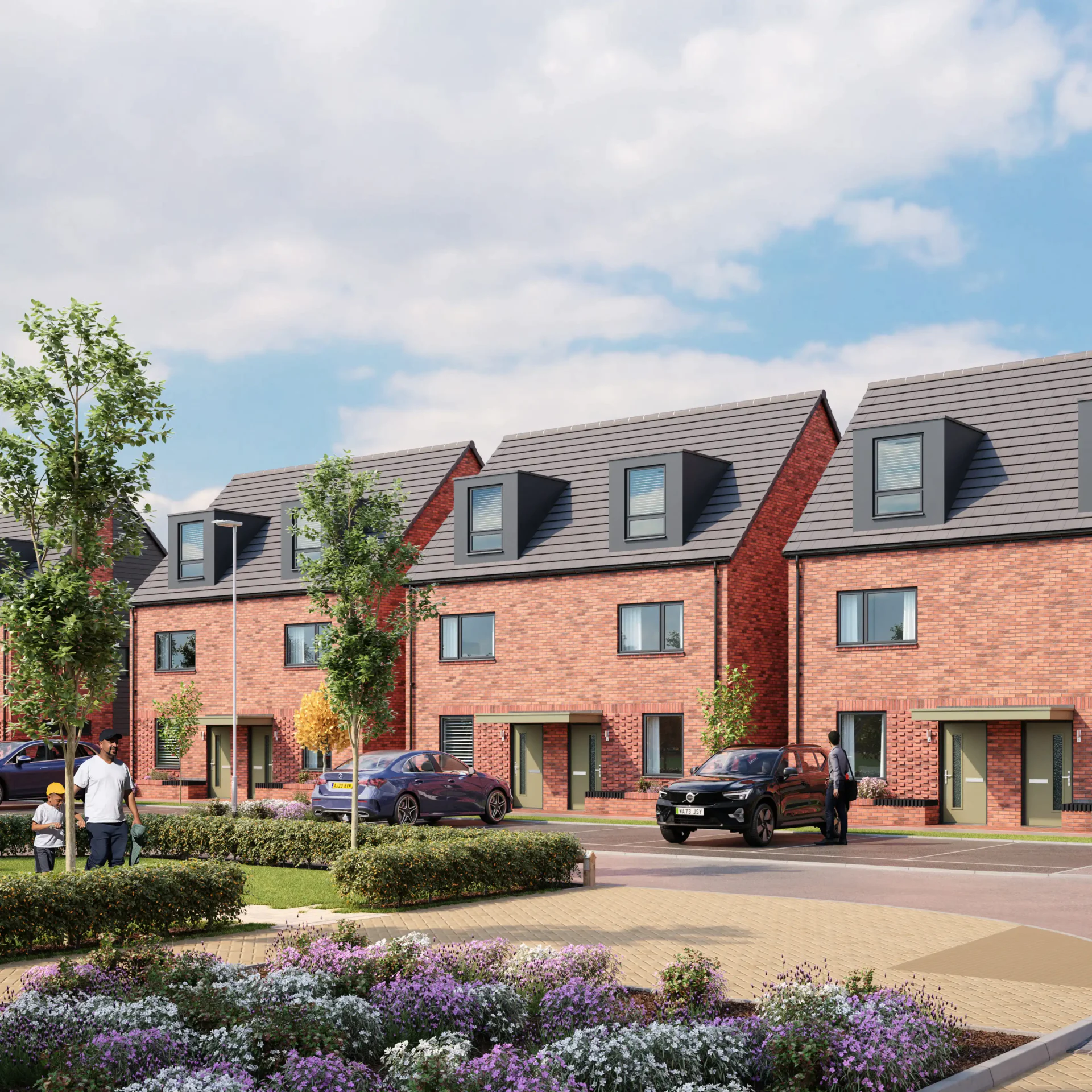
Rooted in nature, designed for living. The Woodlands is a new rental community of 117 single-family homes, seamlessly blending modern living with the tranquillity of its surroundings. Nestled beside the ancient Shenley Wood and set within expansive green spaces, it offers a retreat for those seeking balance – where the energy of the city meets the calm of nature.
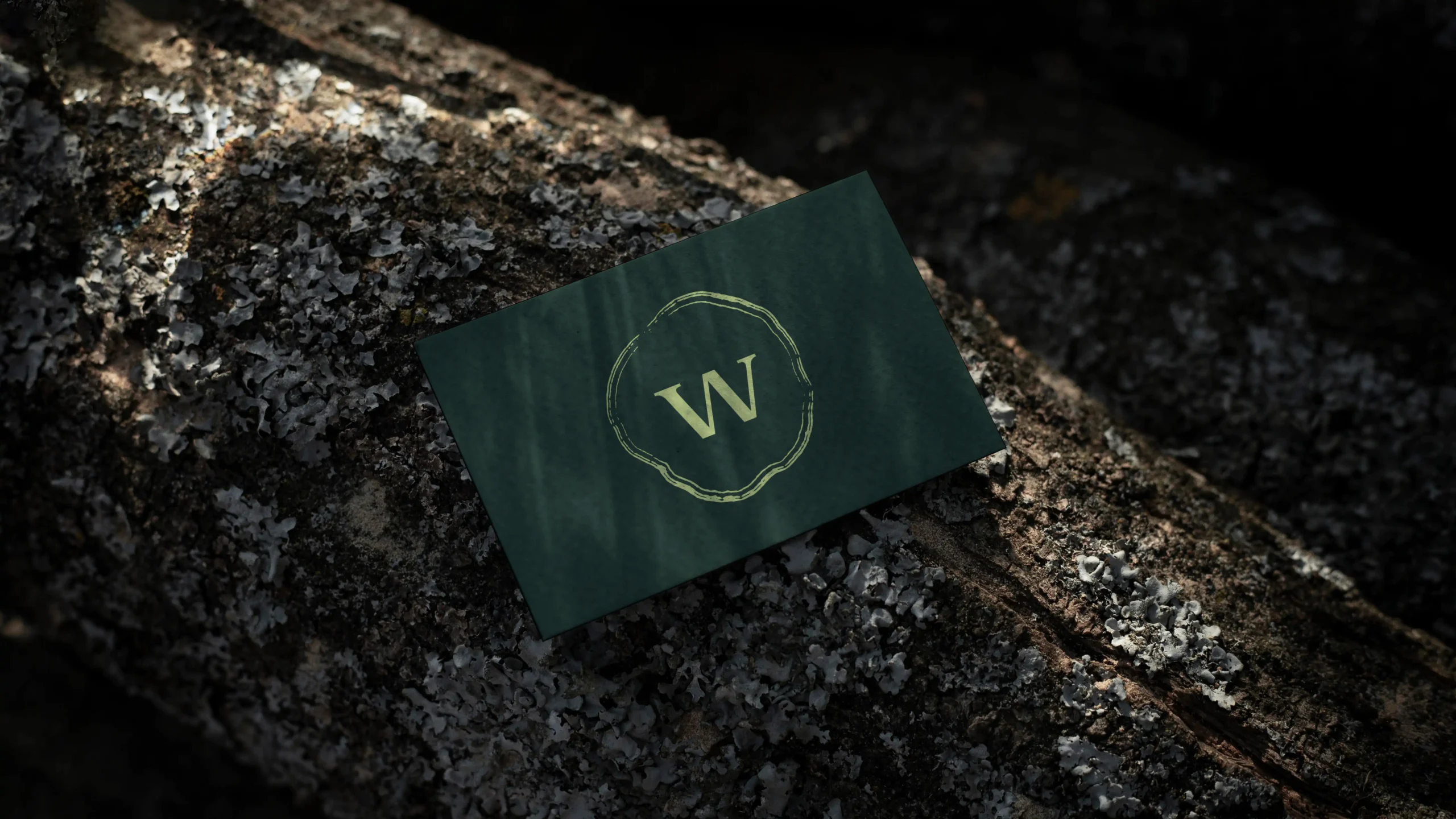
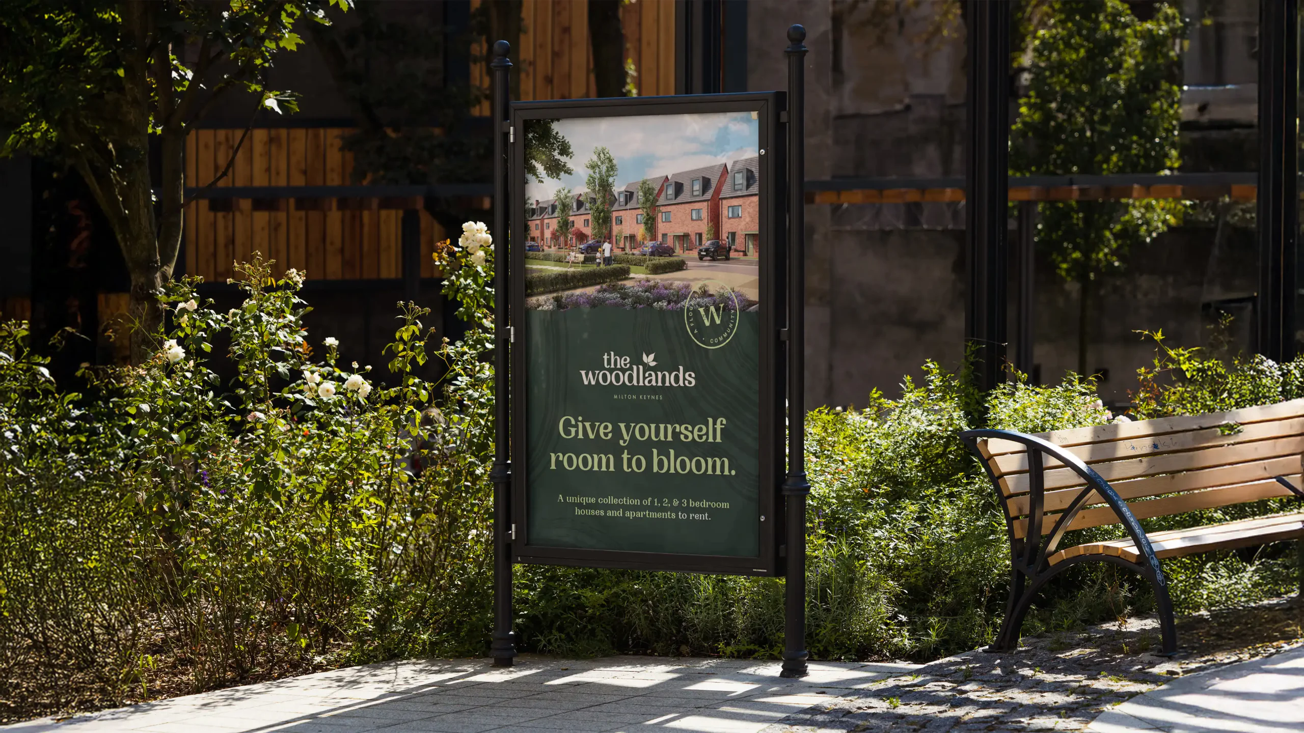
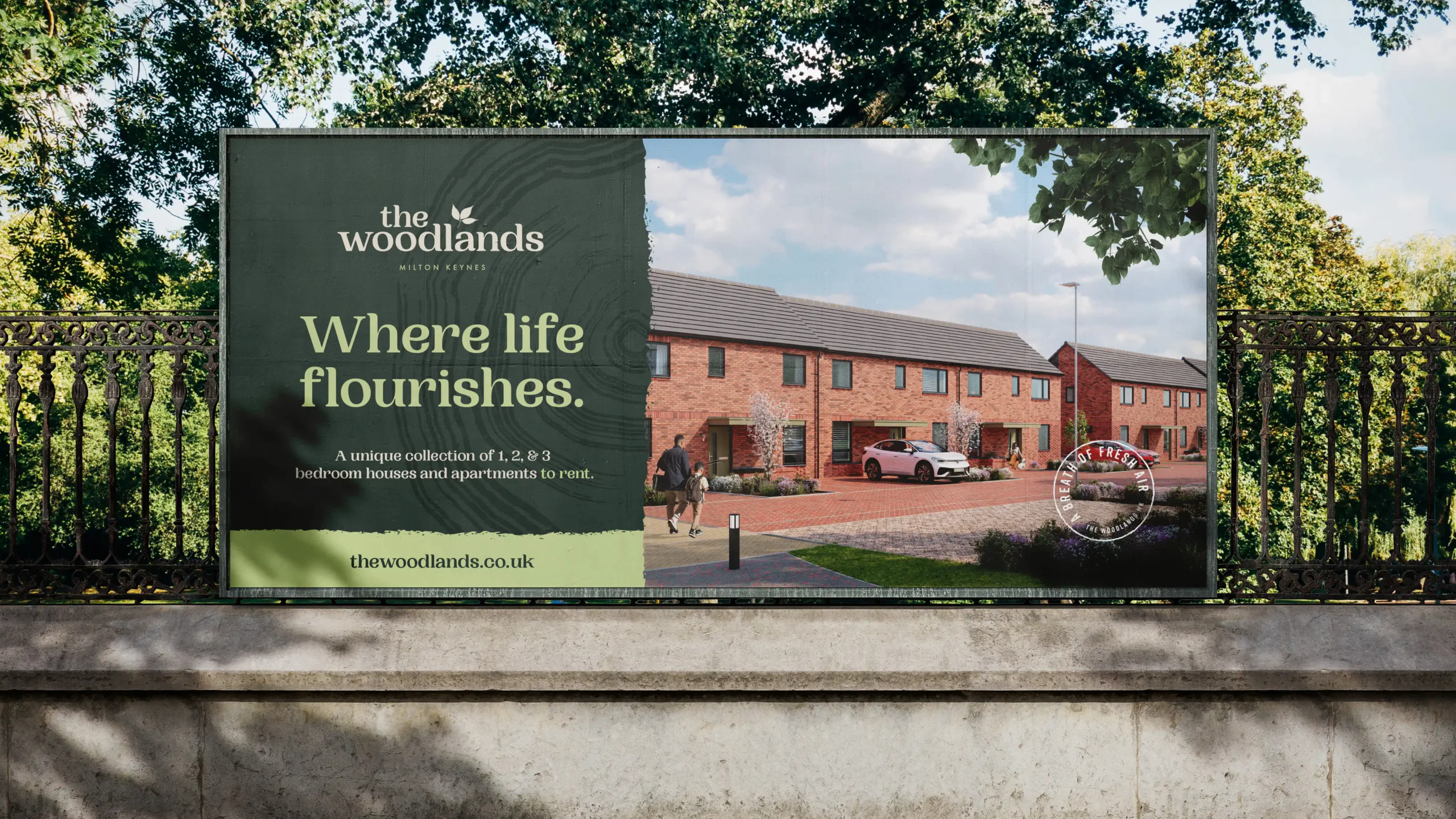
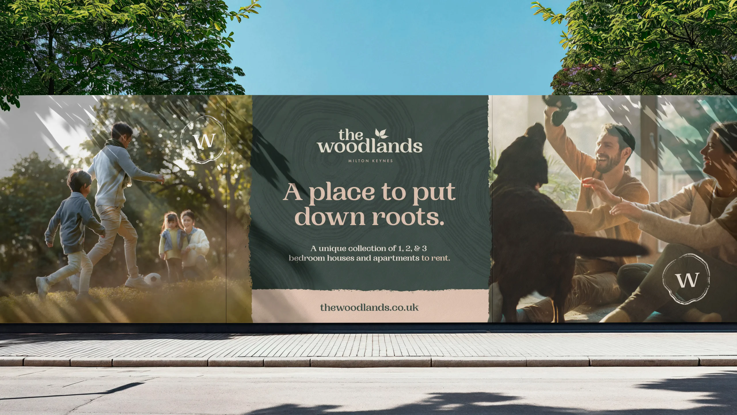
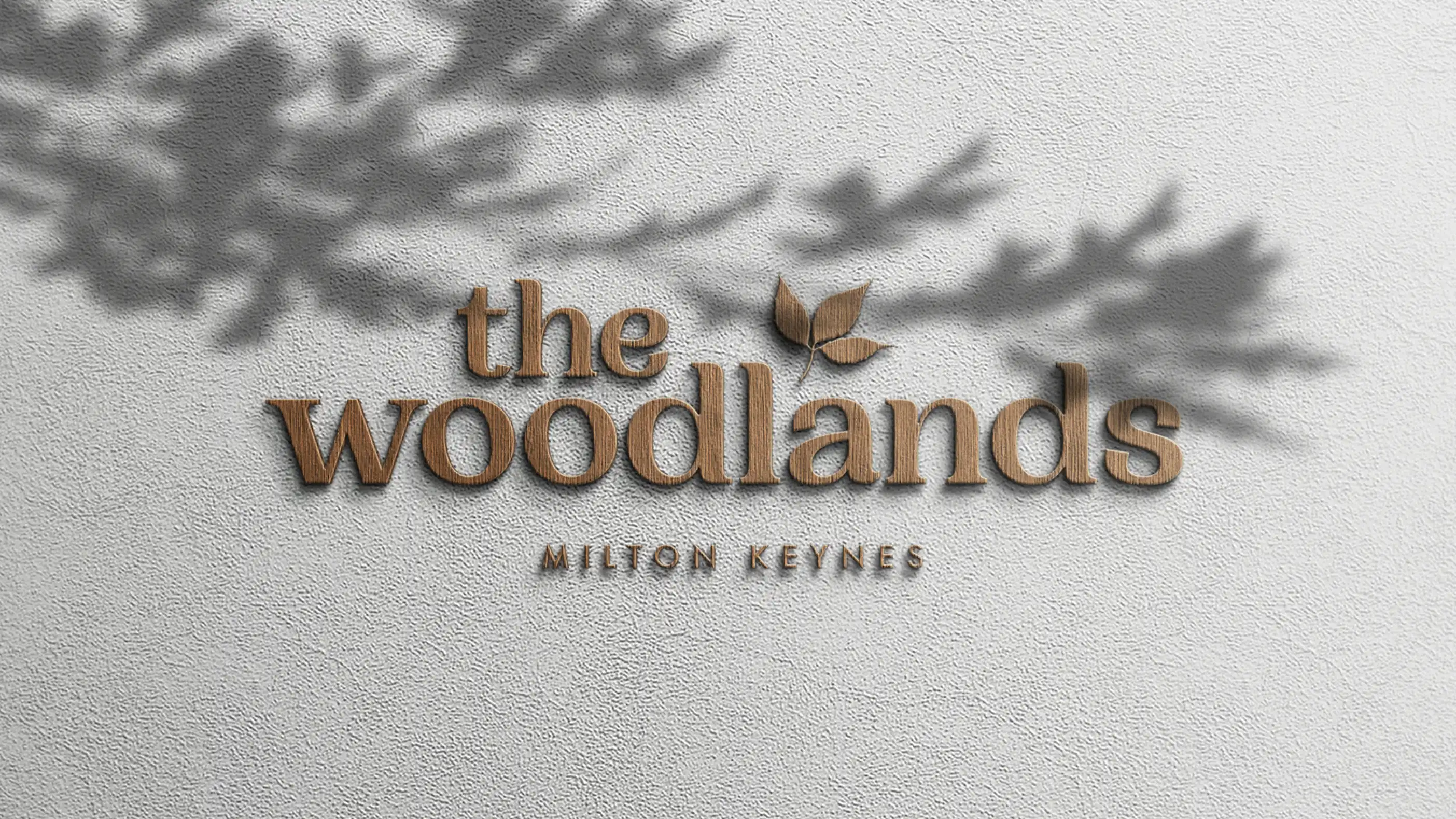
The brand needed to reflect this connection. Inspired by the landscape, we created a logotype featuring an integrated leaf motif, paired with a soft, lowercase typeface that feels warm, inviting, and effortless. Earthy hues like moss green and fawn bring a sense of calm, grounding the identity in the natural beauty of its surroundings.
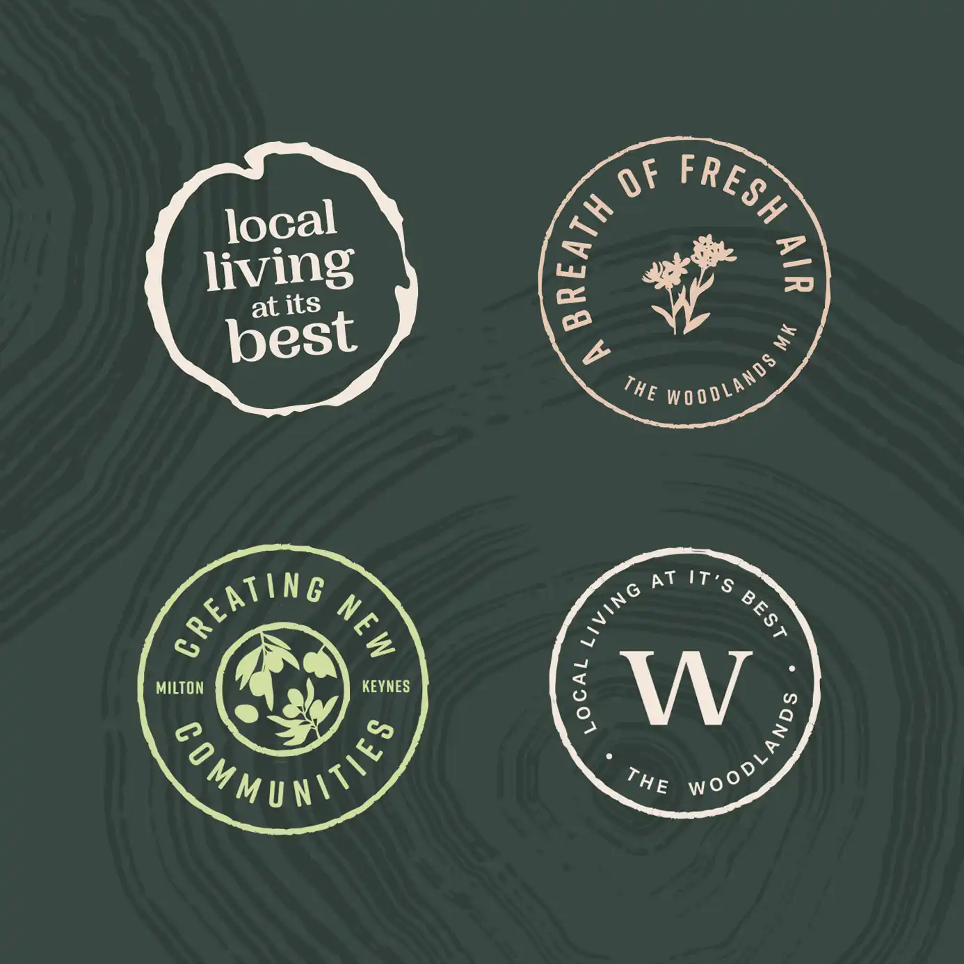
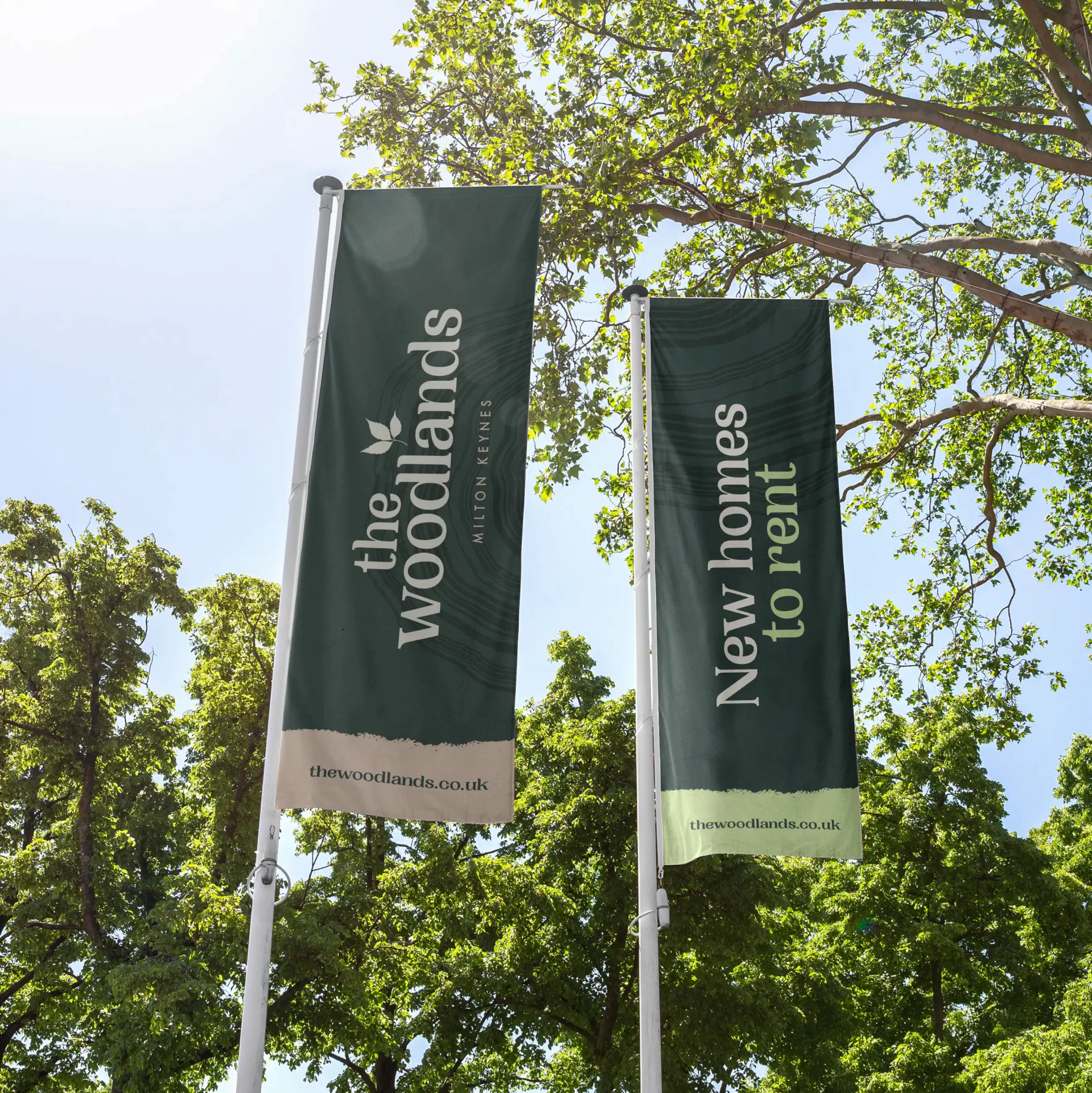
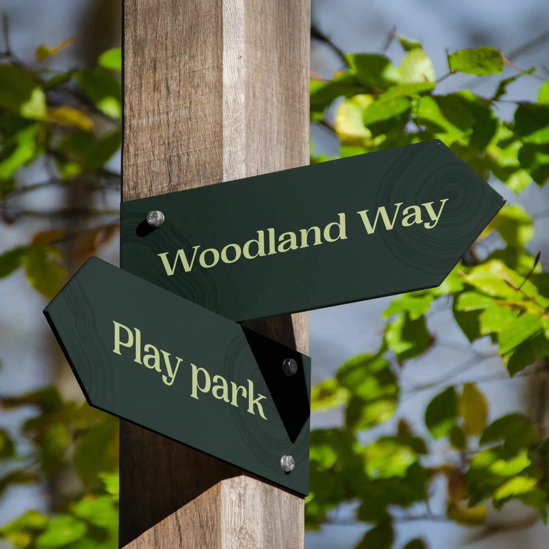
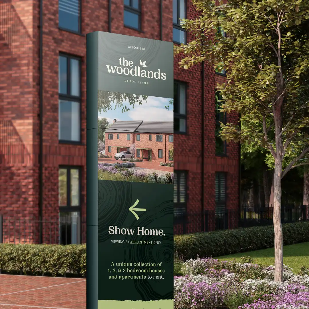
Design elements mirror the rhythm of nature. Tree ring patterns weave through signage, digital touchpoints, and print collateral, reinforcing a deep connection to the landscape. Every detail is considered, creating an identity that feels timeless, welcoming, and instinctively familiar. The Woodlands is more than a place to live. It is a place to grow, to breathe, and to belong.


More


Social
© SOCIETY STUDIOS 2026
